


The WPF Flaming Progress Bar: Part 1
2011-03-12
A coworker recently wanted to create a round progress bar to indicate status of a test tube. Sounded reasonable, but these are the kinds of seemingly simple things in WPF that can suck-up hours of time. As part of the software, we need to indicate the progress of a heating process. So what if we made the progress bar on fire? And the fire would grow as the tubes reached the target temperature!
Okay, so that's a totally gratuitous use of graphics in WPF. But it also makes a good learning excercise. So let's see how to do it.
The cardinal rule of the ProgressBar control
To customize the progress bar you must know one vital rule. The progress bar contains two named parts called PART_Track and PART_Indicator. The Width property of PART_Indicator is zero when the ProgressBar.Value property equals ProgressBar.Minimum, and the Width property of PART_Indicator is equal to the Width property of PART_Track when the ProgressBar.Value property equals ProgressBar.Minimum. Understand this rule, and you can make a progress bar that is a rectangle or a circle or a dancing flaming chicken or anything.
Making use of the rule
First, we need to create a project where we can experiment with the control template for the progress bar:
<Window x:Class="FlamingProgressBar.Window1"
    xmlns="http://schemas.microsoft.com/winfx/2006/xaml/presentation"
    xmlns:x="http://schemas.microsoft.com/winfx/2006/xaml"
    Title="Progress Bar Test" Height="150" Width="610">

    <Window.Resources>

        <Style TargetType="ProgressBar">
            <Setter Property="Width" Value="100" />
            <Setter Property="Height" Value="100" />
            <Setter Property="Margin" Value="10,0,10,0" />
            <Setter Property="Template">
                <Setter.Value>
                    <ControlTemplate TargetType="ProgressBar">

                        <!-- Custom progress bar goes here -->

                    </ControlTemplate>
                </Setter.Value>
            </Setter>
        </Style>
    </Window.Resources>

    <StackPanel Orientation="Horizontal">

        <ProgressBar Value="0"   />
        <ProgressBar Value="25"  />
        <ProgressBar Value="50"  />
        <ProgressBar Value="75"  />
        <ProgressBar Value="100" />
    </StackPanel>
</Window>
So that is our starting point. Now, here is a simple rectangular progress bar.

<Border Name="PART_Track" Width="{TemplateBinding Width}" BorderBrush="{TemplateBinding BorderBrush}" BorderThickness="{TemplateBinding BorderThickness}" Background="{TemplateBinding Background}"  >
    <Rectangle Name="PART_Indicator" HorizontalAlignment="Left" Fill="{TemplateBinding Foreground}" Height="{TemplateBinding Height}" />
</Border>
Notice this follows the cardinal rule - the PART_Track is a simple border, and the PART_Indicator rectangle has no Width property specified. This is because the ProgressBar control will adjust the width automatically for us. We use TemplateBinding for any properties that come from the ProgressBar, such as Opacity and Foreground.
Now let's make a circle that grows bigger with progress:

<Border Name="PART_Track" BorderBrush="{TemplateBinding BorderBrush}" BorderThickness="{TemplateBinding BorderThickness}" Background="{TemplateBinding Background}"  >
    <Ellipse Name="PART_Indicator" Fill="{TemplateBinding Foreground}" Height="{Binding Width, ElementName=PART_Indicator}" />
</Border>
The Width of the ellipse increases when Value changes. Since we want a circle, the Height is bound to the Width. Removing the {TemplateBinding Height} makes the ellipse grow wider but not taller.
The WPF Flaming Progress Bar: Part 2
Attempt 1, using clipping
So in part 2, we try to apply our knowledge to create a filled circle. This requires a few more tricks. This is a good point to read a great summary of the different types of brushes available in WPF thanks to Mahesh Chand. Armed with this knowledge, my first attempt was to create a Rectangle, and clip the rectangle with an Ellipse:
<Border Name="PART_Track" BorderBrush="{TemplateBinding BorderBrush}" BorderThickness="{TemplateBinding BorderThickness}" Background="{TemplateBinding Background}"  >
    <Rectangle Name="PART_Indicator" HorizontalAlignment="Left" Fill="{TemplateBinding Foreground}" Height="{TemplateBinding Height}" >
        <Rectangle.Clip>
            <EllipseGeometry RadiusX='50' RadiusY='50' Center='50,50'/>
        </Rectangle.Clip>
    </Rectangle>
</Border>
The problem here is that EllipseGeometry has RadiusX and RadiusY instead of Width an Height. But remember our Cardinal Rule from part 1: The ProgressBar control only knows how to update the Width property. Further, even though we could use some data binding trickery to bind the Width setting to the RadiusX property, RadiusX must be half the Width. That would require writing an IValueConverter to divide the value by 2. While this isn't very difficult, I wanted a XAML-only solution if possible.
Attempt 2, using VisualBrush
For my second attempt, can I make an ellipse, but fill it with a rectangle? The fill should then clip to the shape of the ellipse right? Thanks to .NET 3.5, and a tutorial on VisualBrush, I can.
This example creates an ellipse, and fills it with a rectangle. Only... it doesn't quite work. :-(

<Ellipse Name="PART_Track" Stroke="{TemplateBinding BorderBrush}" StrokeThickness="{TemplateBinding BorderThickness}" >
    <Ellipse.Fill>
        <VisualBrush>
            <VisualBrush.Visual>
                <Rectangle Name="PART_Indicator" HorizontalAlignment="Left" Height="{TemplateBinding Height}" Fill="{TemplateBinding Foreground}" />
            </VisualBrush.Visual>
        </VisualBrush>
    </Ellipse.Fill>
</Ellipse>
Something went wrong: The ellipse was either entirely filled, or empty. Why did WPF not scale the Width property of the Rectangle? It turns out that VisualBrush acts like a ViewBox. No matter how small the rectangle is, it scales to fit the entire fill area. That isn't what we want. We really want the transparent area to remain transparent. The simple workaround for this is to fill the unused area as well. We can do this by placing the rectangle inside a border, just like before.

<Ellipse Name="PART_Track" Stroke="{TemplateBinding BorderBrush}" StrokeThickness="{TemplateBinding BorderThickness}" >
    <Ellipse.Fill>
        <VisualBrush>
            <VisualBrush.Visual>
                <Border Width="{TemplateBinding Width}" Height="{TemplateBinding Height}" Background="{TemplateBinding Background}">
                    <Rectangle Name="PART_Indicator" HorizontalAlignment="Left" Height="{TemplateBinding Height}" Fill="{TemplateBinding Foreground}" />
                </Border>
            </VisualBrush.Visual>
        </VisualBrush>
    </Ellipse.Fill>
</Ellipse>
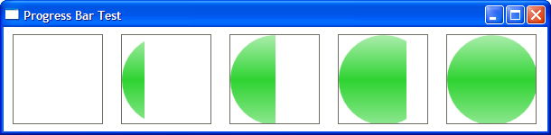
That did it! Now we have a nicely rounded progress bar. It's time to get silly in part 3...
Download the progress bar example code.
The WPF Flaming Progress Bar: Part 3
So now we come to the fun part: Fire!!! To do this, we need to create some real-time fire, and draw it onto a WPF image. Then, we place this image as the fill for our progress bar. I am going to do this by taking some old-skool demo effects and porting them to C#. The key to drawing them in WPF is the WritableBitmap class. This class allows us to take a byte array and copy it onto an ImageSource.

More details on how this works if people request it! For now, the code is well commented and should serve as a decent example...